THE RUG HOUSE

Indigo Courtyard — Blue Rugs & Textile Accents

A tightly edited colour-and-form story for shoppers comparing blue rug, indigo rug, navy rug, blue area rug, Indian blue rug. The collection keeps the palette coherent while letting fibre, weave and shape vary, so the result feels like a design direction rather than a search-results page.

Start with the room’s existing hard finishes and upholstery, then decide whether the rug should blend into that palette or create the strongest contrast in the space. Compare dimensions and material on each product page before choosing.

INDIGO COURTYARD
15 pieces

A colour story with commercial relevance

This Bespoke line naturally answers searches around blue rug, indigo rug, navy rug, blue area rug, Indian blue rug, but the content is written for people first: tone, contrast, fibre, proportion and room placement remain the decision framework.

How to use the palette

  • Compare the rug against floor colour in daylight and evening light.
  • Repeat one rug colour in a smaller textile or object rather than matching everything.
  • Use a larger rug for a calmer field of colour; use a smaller accent rug when you want the colour to read more strongly.
  • Check material, weave and exact colour on the individual product page.

Suitable wherever this colour family supports the room: living rooms, bedrooms, dining spaces, entries and passages.

Construction varies by piece. Use the individual product details for verified braid, weave, fibre and print technique.

Follow material-specific care and avoid assuming a single cleaning method across jute, cotton and blended constructions.

Search themes

blue rug, indigo rug, navy rug, blue area rug, Indian blue rug.

Frequently asked questions

How do I choose between a tonal rug and a contrast rug?

A tonal rug creates a quieter field; a contrast rug becomes a stronger focal point. Base the decision on how visually active the furniture and walls already are.

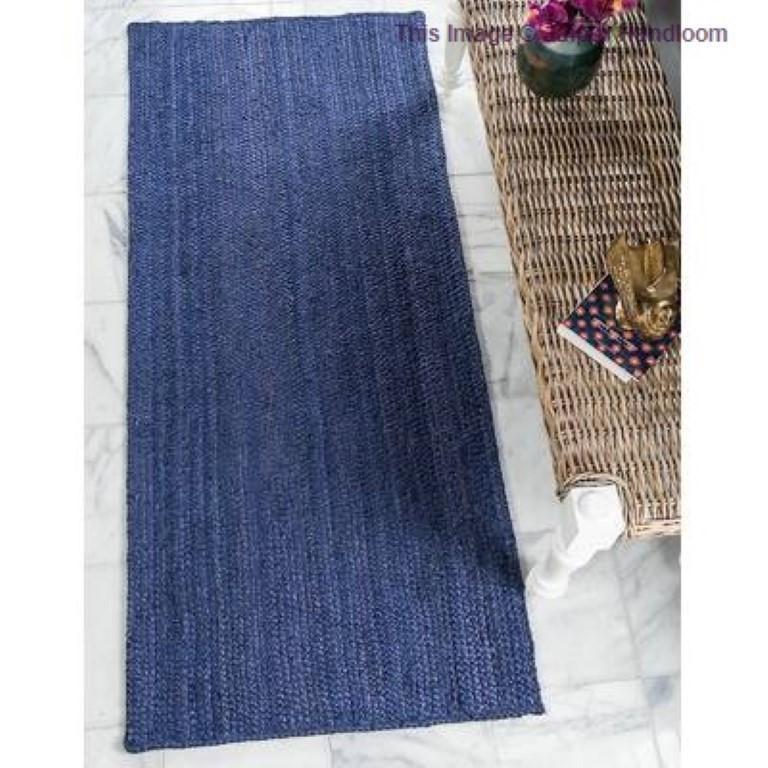
It belongs to INDIGO COURTYARD because indigo, navy, denim and mineral blue across woven form. The hand-braided structure reinforces that language through material rather than ornament.

The hand-braided construction keeps the character of jute visible rather than smoothing it away. Subtle irregularity is part of the appeal, giving the surface depth rather than mechanical uniformity.

The proportions suit hallway. Its long proportion strengthens a sightline and gives transitional space the same design attention as the main room.

Pair it with oak, off-white upholstery, muted brass or chalky walls so the blue stays architectural. Repeating one natural-fibre texture elsewhere in the room creates continuity without matching.